Data Visualizer
This chapter refers to the legacy version of the Data Visualizer.
For the current version, see the new Data Visualizer.
About the Data Visualizer App
The Classic Data Visualizer app lets you select indicators, data elements, periods, and organisation units for analysis.
It works well on poor connections and generates charts in the web browser.
Tips
- Click series labels in the chart to hide/show them.
- Use the triple-left-arrow on the top center to collapse the side menu.
Create a Chart
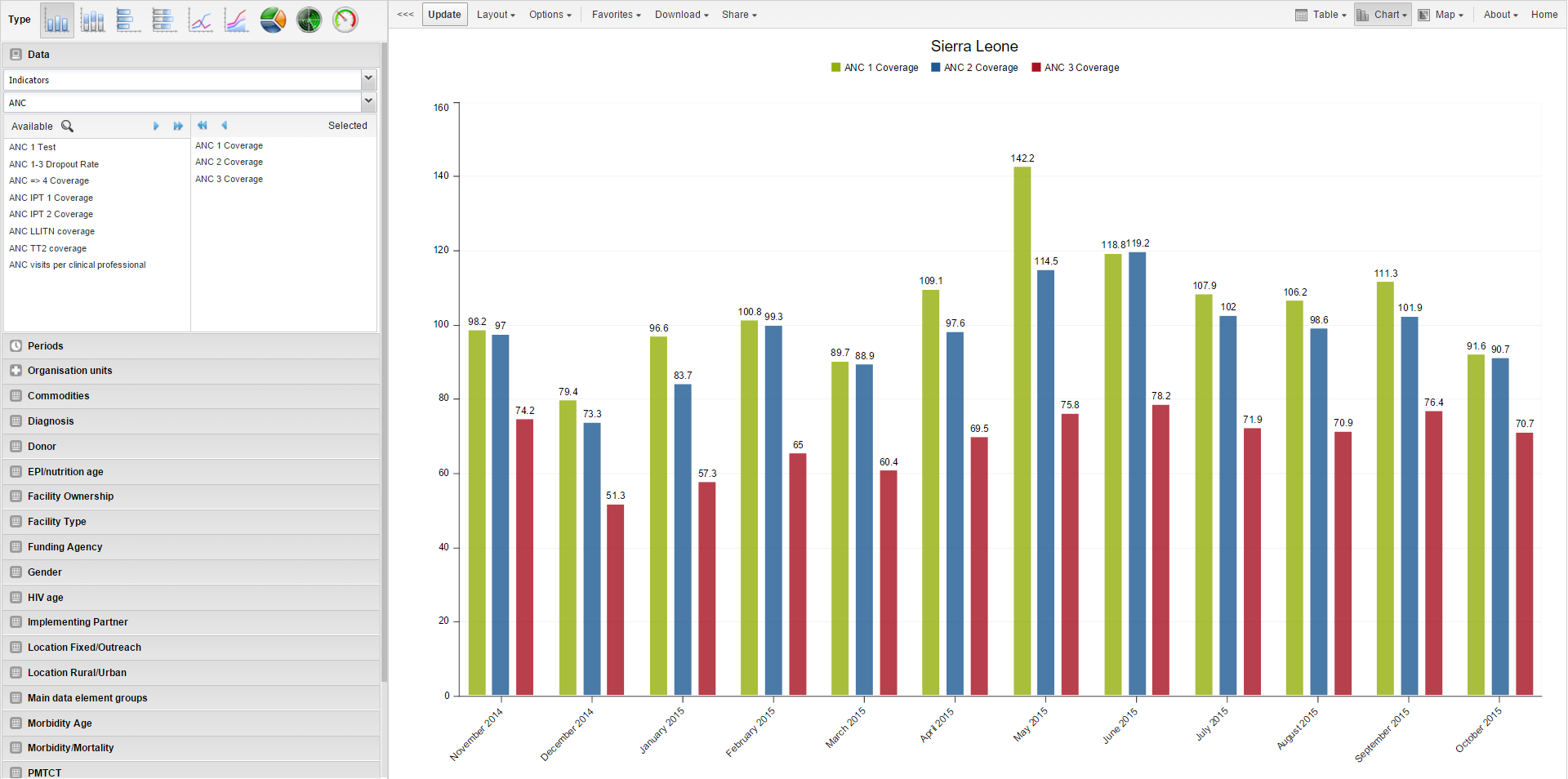
- Open the Classic Data Visualizer app and choose a chart type.
- Select metadata from all three dimensions:
- Data (indicators, data elements, reporting rates)
- Periods (fixed or relative)
- Organisation units
- Click Layout to arrange dimensions.
- Click Update to generate the chart.
Note:
Default period type can be changed in:
System Settings → General → Default relative period for analysis.
Select a Chart Type
There are nine chart types:
| Chart Type | Description |
|---|---|
| Column chart | Vertical bars for comparison across units. |
| Stacked column | Vertical stacked bars to show sums and trends. |
| Bar chart | Same as column, but horizontal. |
| Stacked bar | Horizontal stacked bars. |
| Line chart | Time-series visualization. |
| Area chart | Filled line chart for comparing trends. |
| Pie chart | Proportional circular chart. |
| Radar chart | Spider chart showing multivariate data. |
| Speedometer chart | Gauge chart (0–100%). |
Select the type under Chart type → click Update.
Select Dimension Items
DHIS2 data uses three main dimensions:
- Data: indicators, data elements, datasets
- Periods: fixed or relative
- Organisation units: where the event occurred
You can select items by:
- Double-click
- Single-arrow / double-arrow buttons
- Clearing items from the Selected list
Select Indicators
- Click Data → Indicators.
- Choose an indicator group.
- Double-click indicators to move them to Selected.
Select Data Elements
Same steps as indicators.
Select Reporting Rates
- Click Data → Reporting rates.
- Double-click rates to add.
Select Fixed & Relative Periods
You may combine both.
- Fixed periods: select a period type, pick periods.
- Relative periods: e.g., Last month, Last 12 months.
Select Organisation Units
- Click Organisation units.
- Select Selection mode:
| Mode | Description |
|---|---|
| Select organisation units | Choose units from the tree or use user-based shortcuts. |
| Select levels | Select all units at a certain hierarchy level. |
| Select groups | Select units by group (e.g., hospitals). |
- Click Update.
Additional Dimensions
Depending on configurations (e.g., age, sex), you may add extra dimensions for analysis.
Series, Category, and Filter
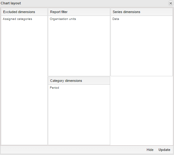
Use Layout to assign:
- Series → trends (e.g., periods)
- Categories → comparison groups (e.g., org units)
- Filter → restrict data (only 1 item allowed for Data dimension)
Drag and drop, then click Update.
Change Chart Display
Use Options to customize chart appearance.
| Option Group | Setting | Description |
|---|---|---|
| Data | Show values | Display numeric values on chart. |
| 100% stacked | Normalize columns to 100%. | |
| Cumulative | Cumulative line values. | |
| Hide empty categories | Remove missing-value items. | |
| Trend line | Show performance trend. | |
| Target/Base line | Add reference lines. | |
| Sort order | Sort values ascending/descending. | |
| Aggregation type | Count, Min, Max, etc. | |
| Events | Include only completed events | Exclude partial events. |
| Axes | Min/Max, ticks, decimals, titles | Customize axis appearance. |
| Style | No space between bars | Useful for EPI curves. |
| General | Hide title, subtitle, legend | Clean up visual appearance. |
Manage Favorites
Favorites allow saving, sharing, and reusing charts.
Open a Favorite
Go to Favorites → Open and pick one.
Save a Favorite
Favorites → Save as → enter Name and Description.
Rename
Favorites → Rename
Interpretations
Write an interpretation for shared favorites:
- Supports bold, italic, emojis, mentions (@username), and URLs.
Subscribe
Receive notifications on updates.
Get Link
Generate links for:
- Use in the app
- Web API (JSON, CSV, etc.)
Delete
Favorites → Delete
View Interpretations for Relative Periods
Click interpretation items to load chart with the correct date context.
Download a Chart
Download → Graphics → PNG or PDF
Download Chart Data Source
Download data behind the chart in various formats:
| Format | Description |
|---|---|
| JSON | ID-based; also Code/Name supported |
| XML | ID-based; also Code/Name supported |
| Excel | ID/Code/Name |
| CSV | ID/Code/Name |
| JRXML | Jasper Report template |
| Raw SQL | SQL used to generate the visualization |
Embed Charts in Any Web Page
Share → Embed in web page
Copy the generated HTML snippet.
Open as Pivot Table or Map
In the chart view, click Chart or Map to switch.